The Tenement Museum
Creating a powerful digital space to tell the story of immigration in America.
The Tenement Museum’s former website was the product of 10 years of add-ons and band-aid solutions. As a result, the site suffered from usability challenges and a lack of information clarity. These problems not only affected the Museum’s ability to use the site as an important communication tool, they also limited user engagement.
Lacking a solid foundation from which it could guide users to their online destination, the website no longer served the Museum’s operations, business goals, and expanding mission.
Visit the website here.
Our task was to design and build a website that could facilitate new relationships with their audiences. Shortly before our website redesign began, the Museum formulated a new 5-year strategic plan that focused not only on increasing visitorship but also on changing how the Museum engaged key stakeholders, including visitors, educators, school groups, members, donors, history enthusiasts, and the media.
The Process
For a website redesign of this scale, Suka approached the project analytically and strategically. Before we began design work, our team sought to understand both the existing site and user challenges both from an admin and user perspective, and to learn more about the Museum’s strategic plan.
Research and Discovery
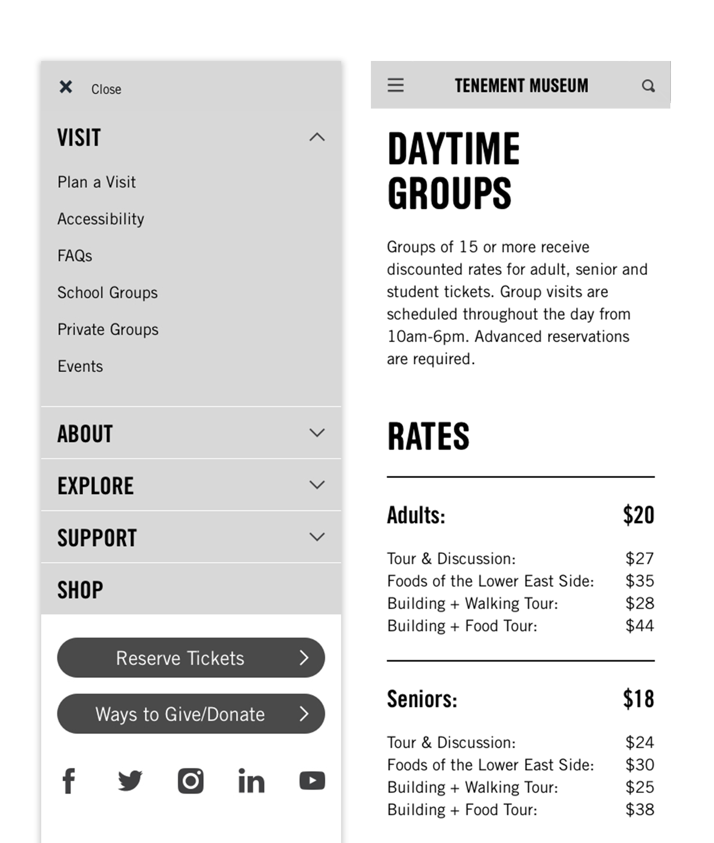
We began with a thorough content and design audit of the Museum’s site, followed by extensive interviews with Museum staff to understand departmental needs and how site operations might evolve in light of the new strategic plan. We also interviewed real users to gain insights into their behavior patterns and potential roadblocks they experienced using the site. Finally, we analyzed websites of peer institutions to put the Tenement Museum’s site in context, to uncover industry best-practices, and to create a set of expected behaviors for features like their new ticketing system.
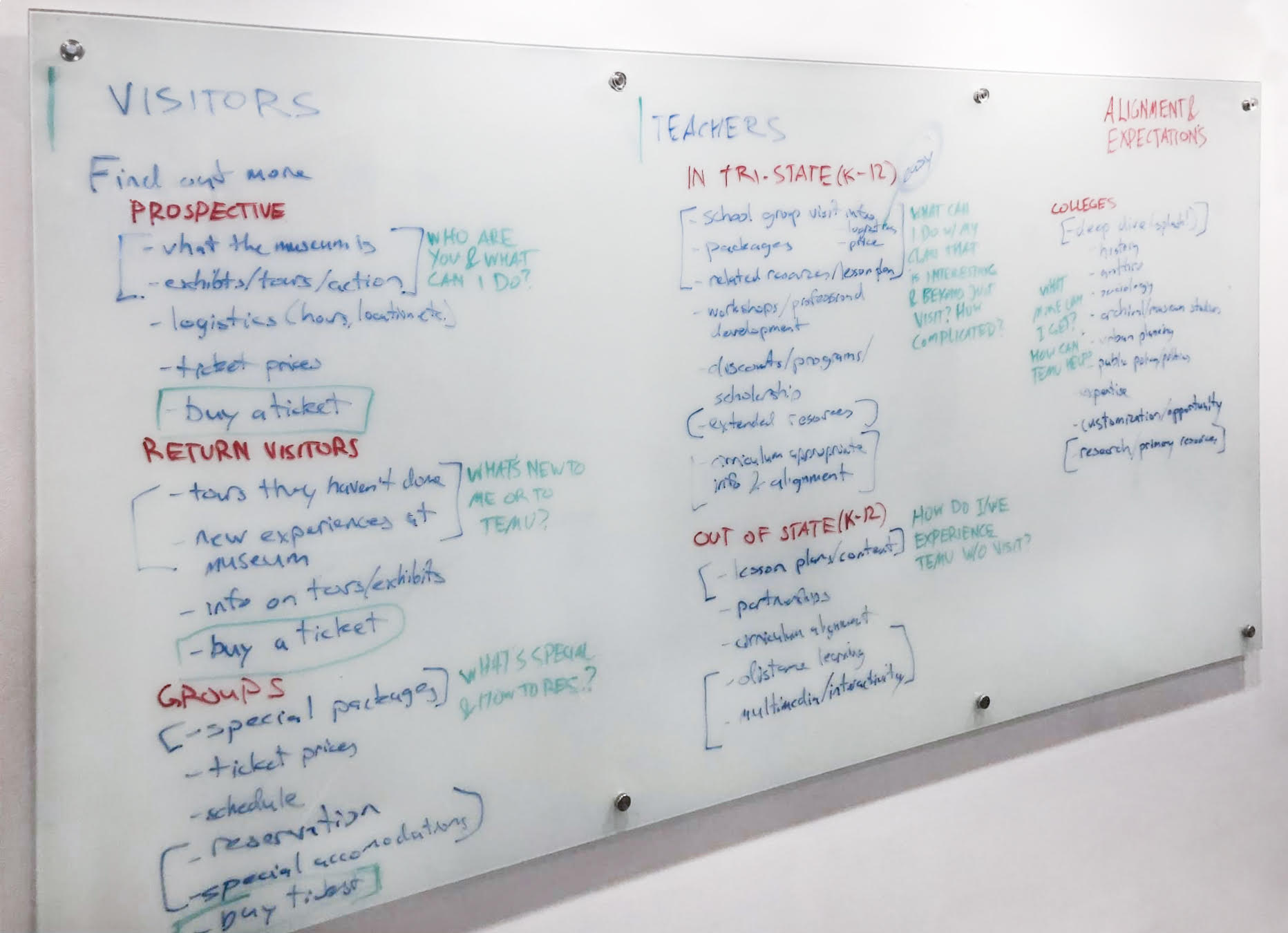
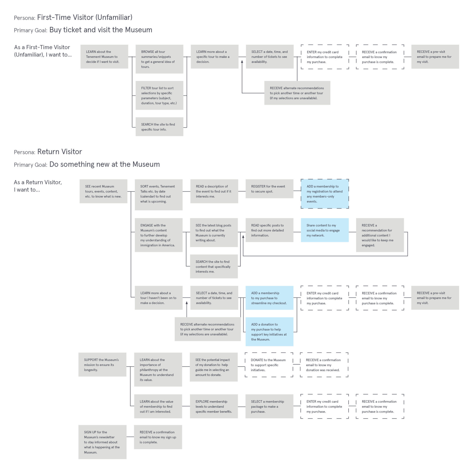
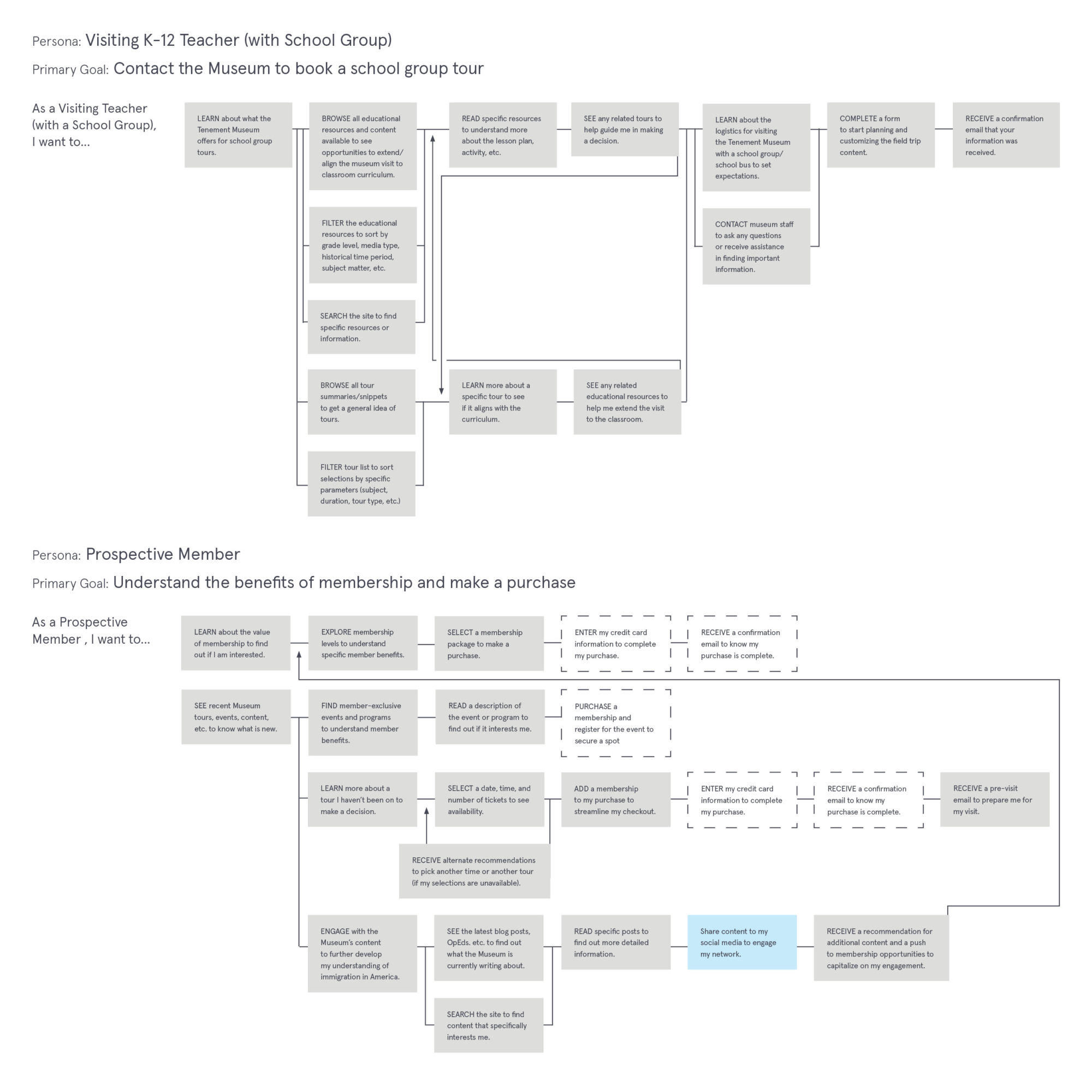
User Personas and User Flows
Based on our discovery activities, we created detailed “personas” for each user type (such as a first time Museum visitor, school teacher, Museum member, etc.). These personas defined goals, expectations and obstacles, as well as content and features most relevant to them as they navigated the site. We built comprehensive user flows that uncovered important touchpoints in a visitor’s experience. This process ensured that we kept usability at the forefront of our designs.
Wireframes
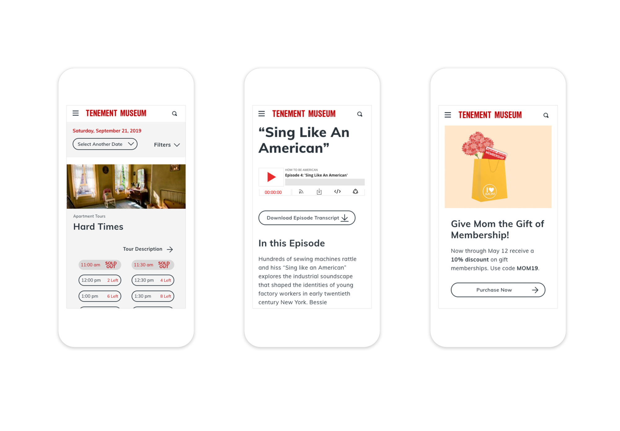
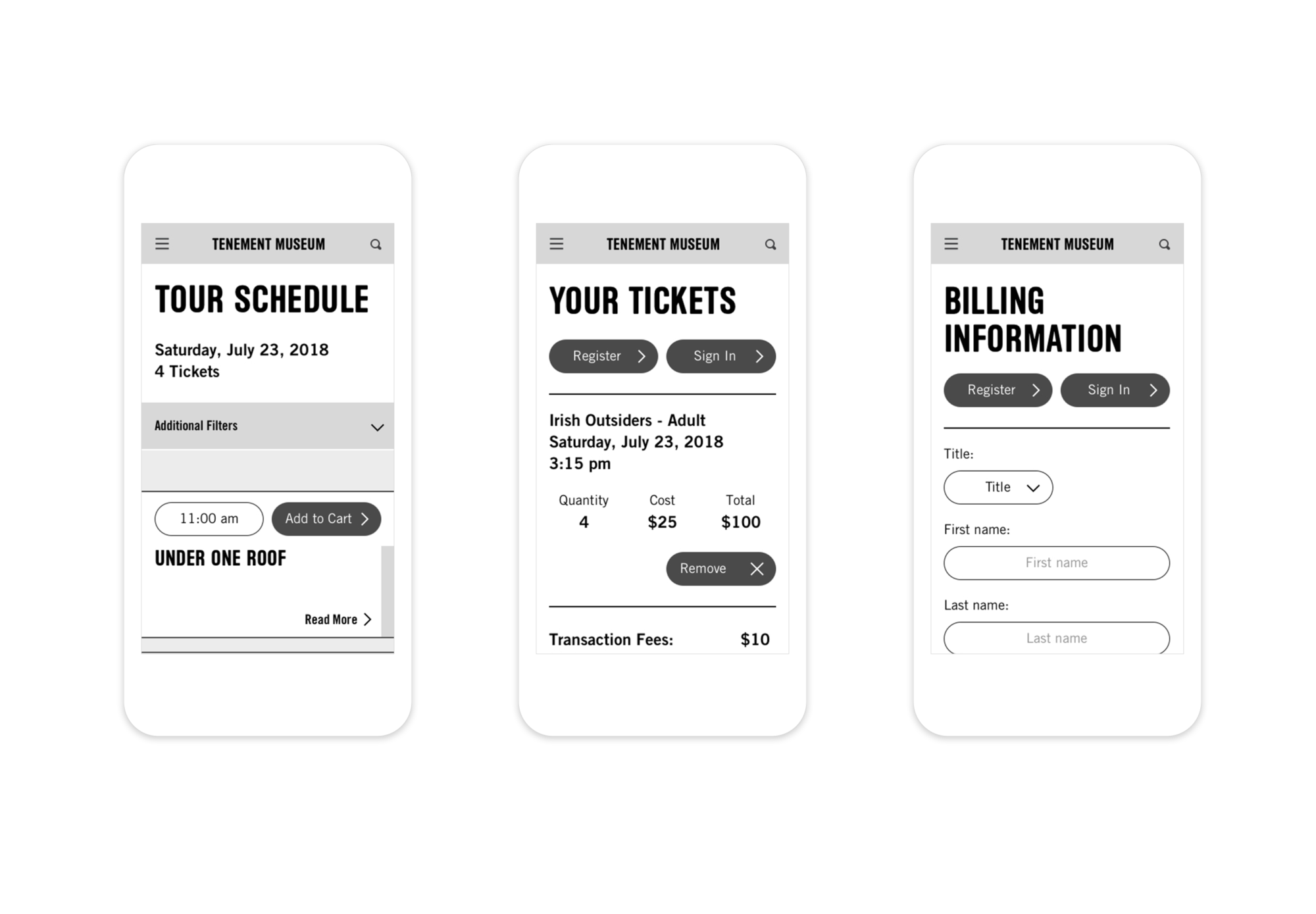
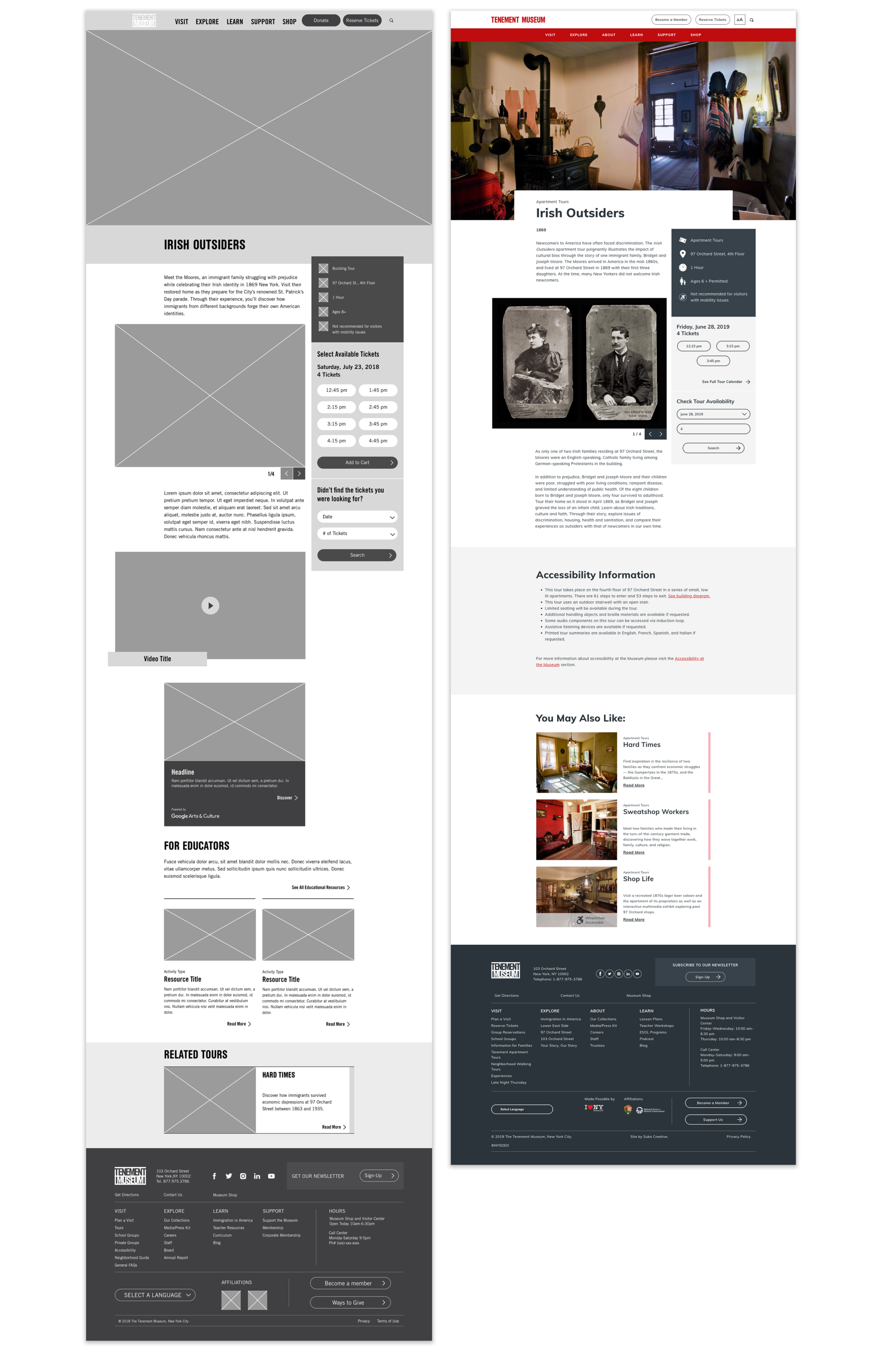
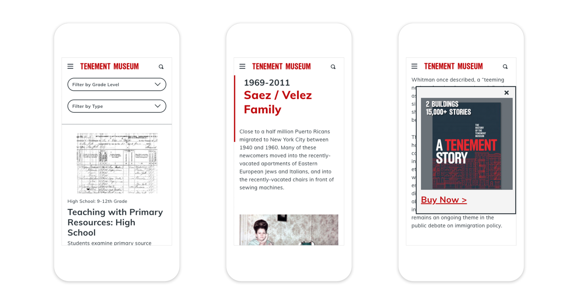
Once we aligned with the Museum on our understanding of their users, we created interactive wireframe prototypes to test our design assumptions with real users. We approached the site from a mobile-first design perspective, ensuring future usability as mobile activity online continues to increase each year.
Visual Design
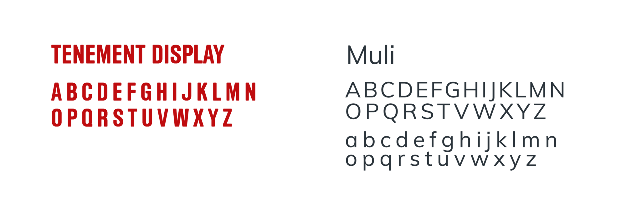
Confident that our user experience design was successful, we applied the Tenement Museum’s brand palette to bring the wireframes to life. We adjusted the primary brand color to ensure usability across digital devices, and introduced secondary colors to differentiate types of tours. We also included a web-friendly typeface to ensure readability at different sizes across various devices.
Colors

Typography
The Result
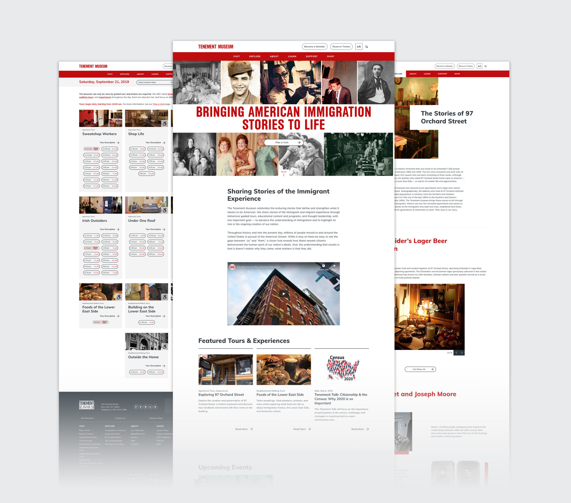
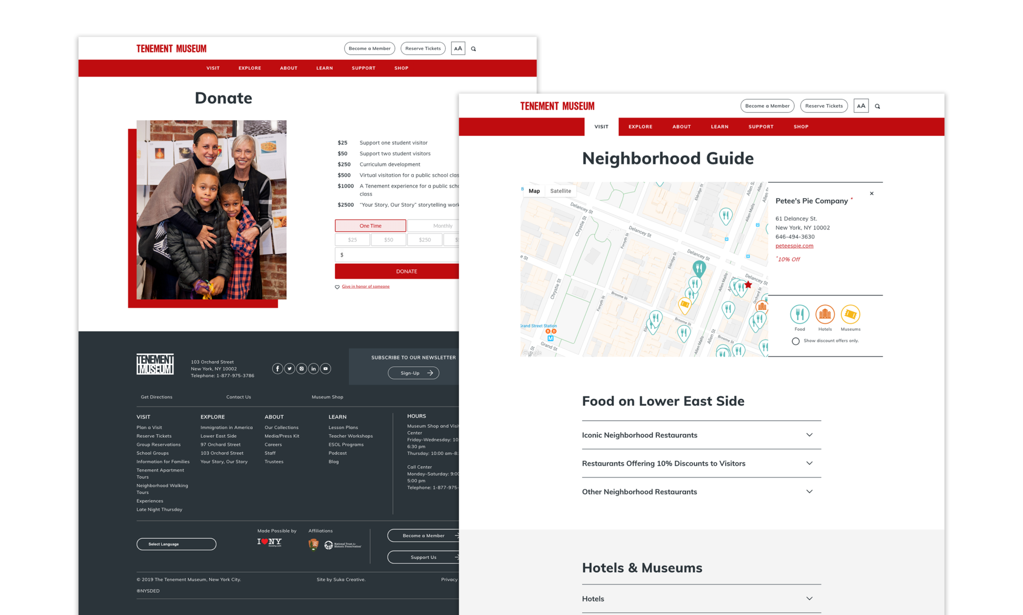
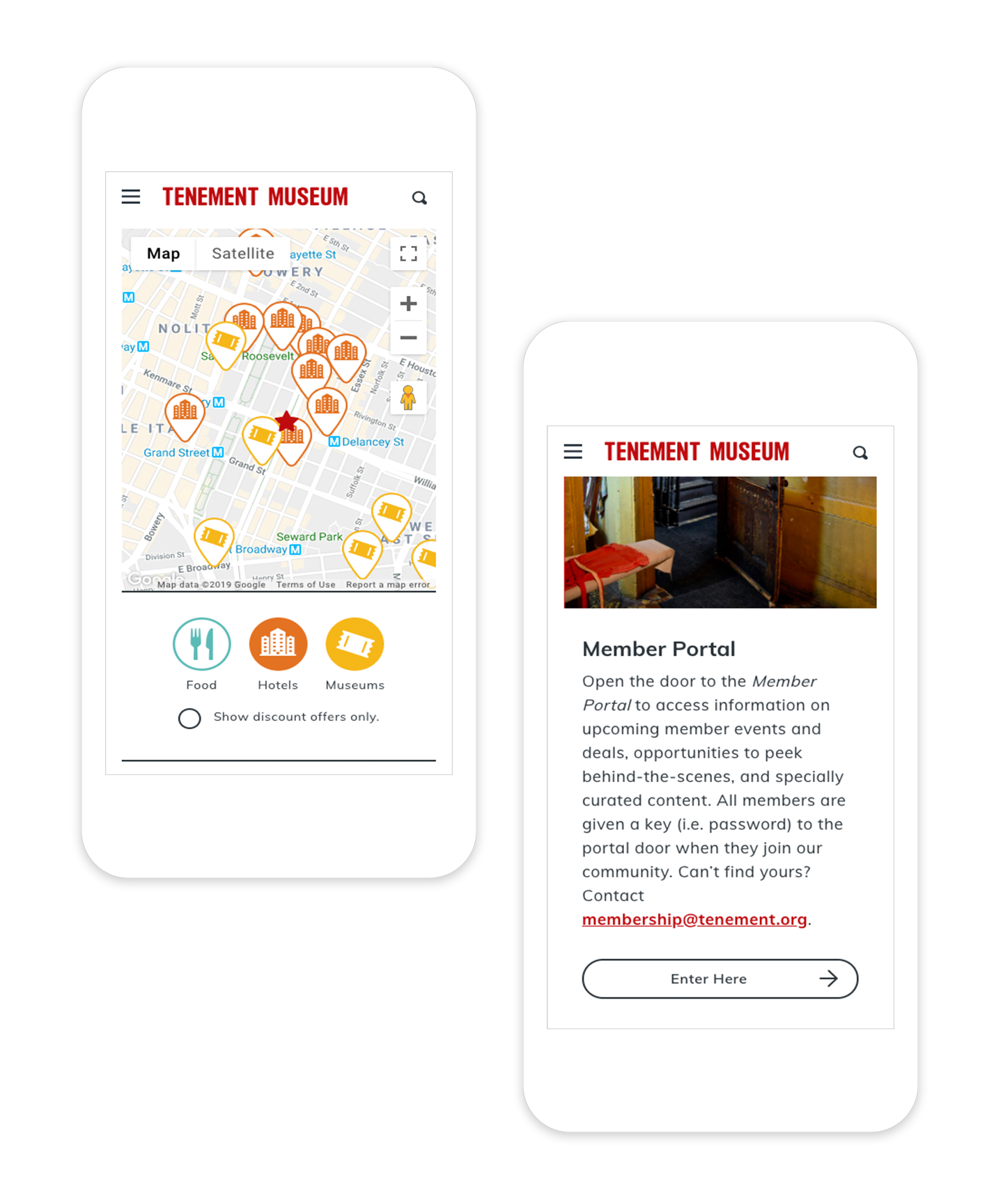
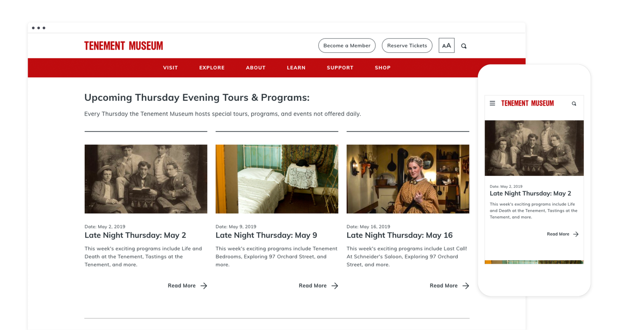
Almost exactly a year to the day from when we began the project, we launched the Tenement Museum’s new site: a media-rich digital experience with a clean, modern, and approachable aesthetic. One of the Museum’s new strategic goals was to reach new audiences and deepen their impact with individuals and groups who may not be fortunate enough to visit New York City. In support of that goal, we delivered a custom WordPress-based CMS with over 20 flexible content modules to support the Museum’s staff in building new sections and pages as needs evolve over time.
In addition, we created entirely new pages for the Museum’s tours, educational resources, events, historical timelines, neighborhood guide, and member-exclusive content. By building out these sections, we provided additional ways for all users to engage with the Museum. We also boosted the Museum’s search equity by expanding the number of pages that will rank for certain keywords.
Our design not only serves the Museum’s many users, it also facilitates their operations with simple yet effective improvements. Beyond connecting the new site with the Tenement Museum’s ticket inventory, housed in Blackbaud’s Altru product, we also set up integrations with the Museum’s email marketing service (MailChimp), their job application system (ADP), and their fundraising platform (GiveLively). We streamlined inbound communications by routing contact form submissions to appropriate staff members based on the inquiry’s subject matter. Through the creation of a ticker-style announcement bar that appears above the navigation on every page, we allowed the Museum to make time-sensitive announcements, such as sudden weather-related closures.
Visit the website here.
“When we were finally able to redesign our site from the ground up, Suka helped us create a new site that for the first time was both a CMS model and search engine optimized. Up until then, our site was designed with technology from over 10 years ago and didn’t serve the Museum’s needs or drive traffic. We’ve now joined the 21st century as far as web technology is concerned and we’re thrilled.”
—David Eng. Chief Marketing and Communications Officer