The Pollock-Krasner Foundation
Showing how art can change lives. Empowering a Foundation to do so.
The Pollock-Krasner Foundation (PKF) has supported the work of extraordinary visual artists for 32 years. As the largest private foundation issuing grants to individual artists, PKF has awarded $72 million to more than 4,000 grantees since its inception. However, its website had fallen behind the digital curve and its online resources and grant application process had become confusing and cumbersome.
Drawing inspiration from the work of Lee Krasner and Jackson Pollock, Suka set out to create a new website that honored and fulfilled the Foundation’s mission of “providing financial assistance to individual working visual artists of established ability.”
Visit the website here.
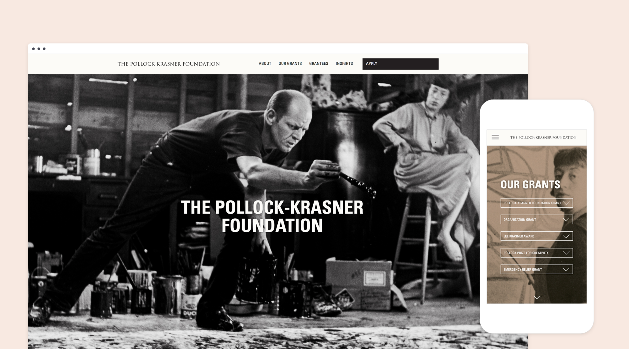
THE PROCESS
We created a design and communication strategy to bring the spirit of the Foundation to life. The cornerstone of this strategy was to create a user experience that would help forge connections with the very artists the Foundation seeks to support. At the same time, Suka’s strategy sought to empower Foundation staff to take ownership over the management and administration of the website.
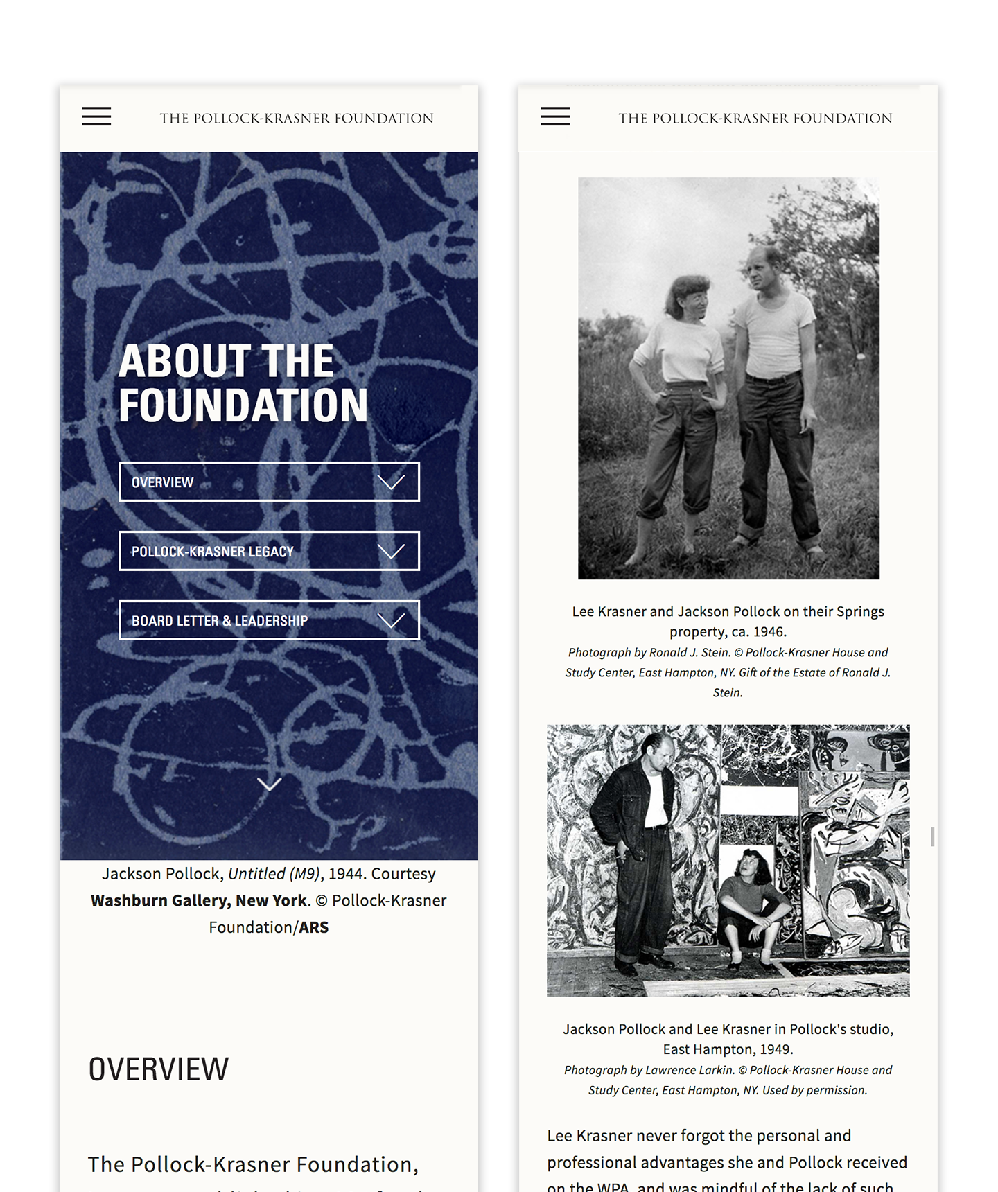
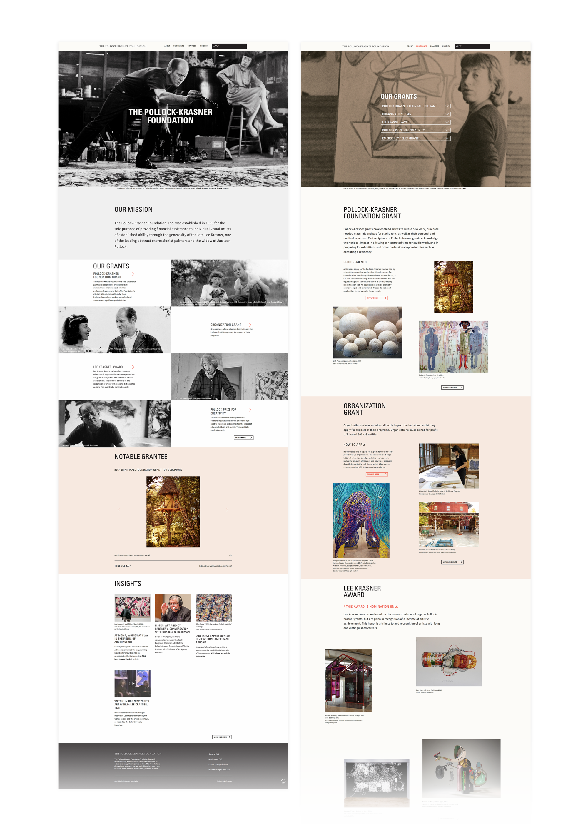
We began by leveraging the visually arresting work of Pollock and Krasner, as well as the work of past grantees, to communicate the power art has to captivate and inspire. Drawing inspiration from blank gallery walls, our image-centric visual approach together with a contemporary user interface invites visitors, and particularly prospective grantees, to explore the site freely. By building a website responsive across all platforms and devices, the new site facilitates usability and encourages users to engage in PKF’s mission.
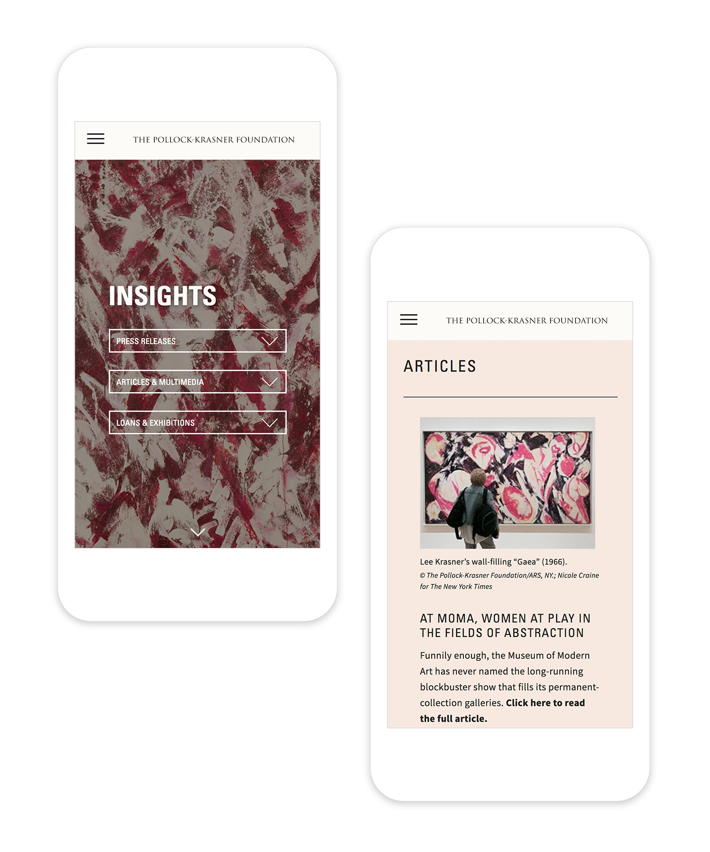
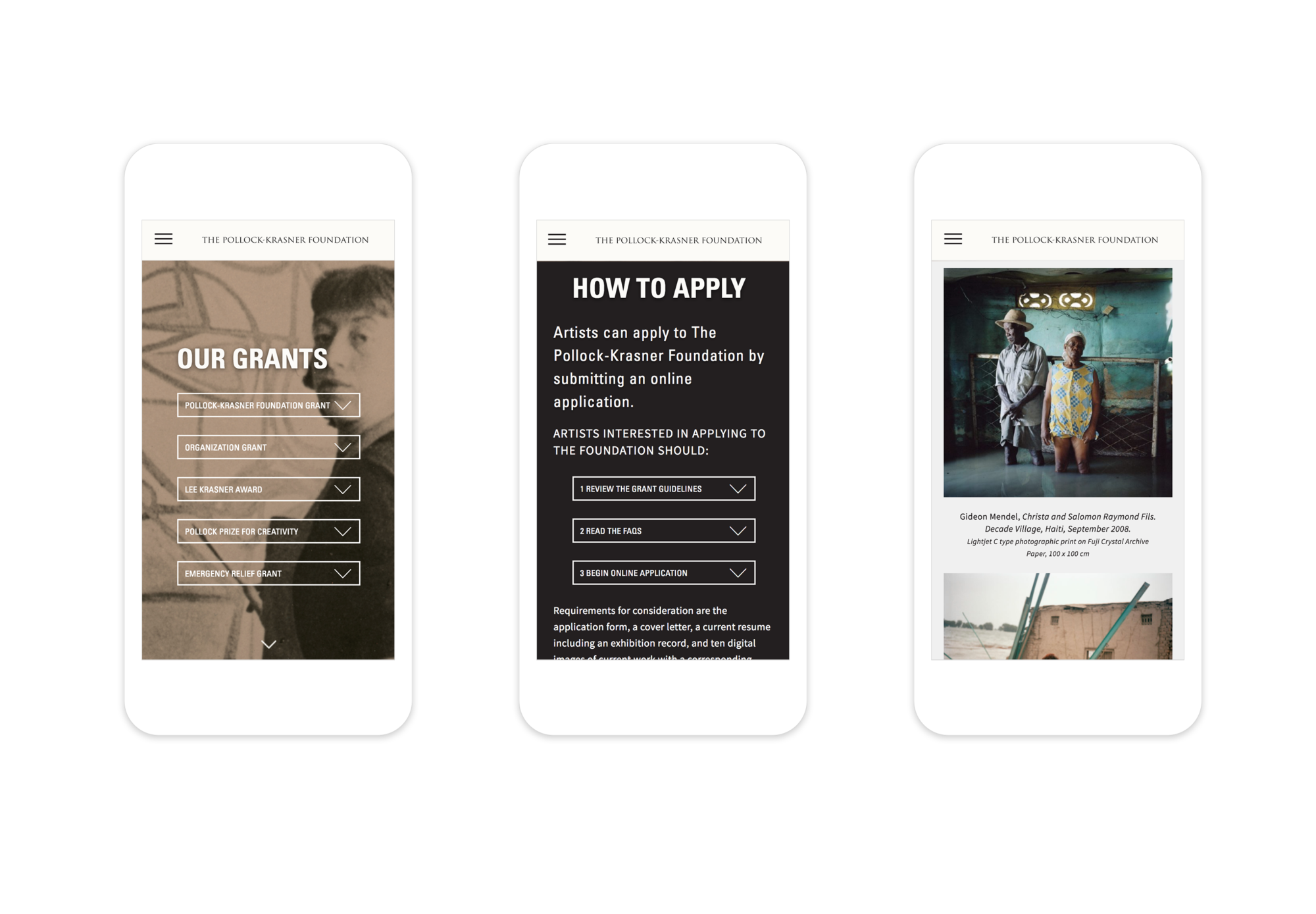
In addition, clearly organized and detailed grant opportunities coupled with an easy-to-follow application process resolved confusion and pain points for both artists and the Foundation. Suka built the new website on a content management system that gave the Foundation the ability to make seamless, real-time updates to the website in-house.
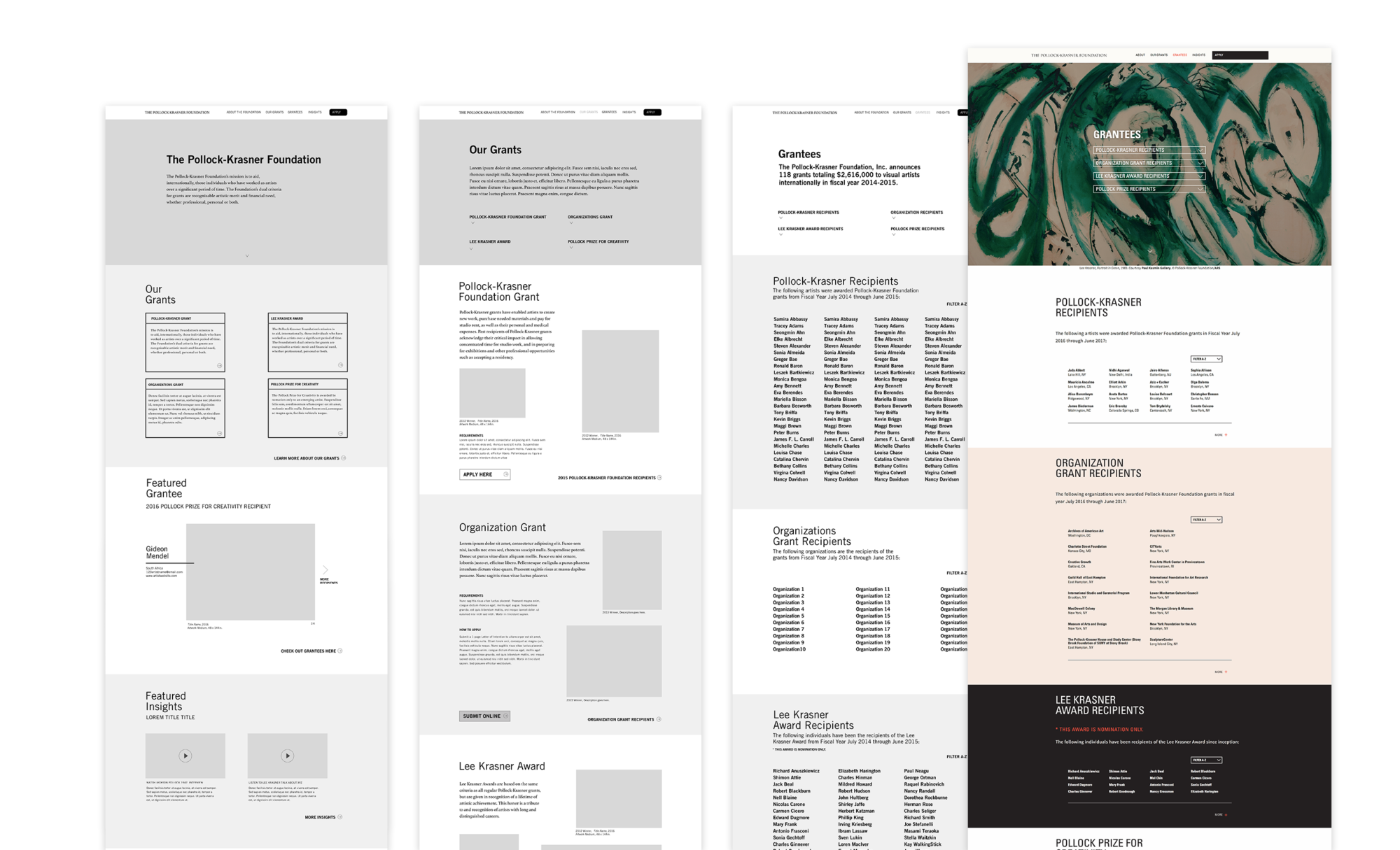
Colors

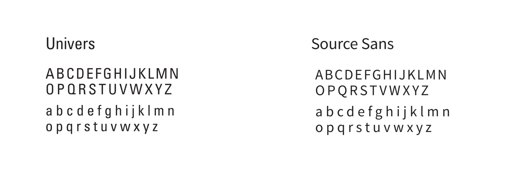
Typography
THE RESULT
The Pollock-Krasner Foundation website is the recipient of the 2017 Web Marketing Association’s WebAwards for Arts Standard of Excellence as well as the Academy of Interactive & Visual Arts’ W3 Silver Award for Non-Profit Standard of Excellence.
Visit the website here.