Madison Capital Funding
Exceeding expectations to deliver a truly audience-centric website.
When Madison Capital Funding (MCF) approached Suka to redesign their website, they set out to evolve the site’s aesthetic to reflect who they are as a company today. MCF wanted a sleek, modern design that would distinguish them in an increasingly competitive market while leveraging the equity of their parent company, New York Life.
As our team began exploring the MCF brand and their market opportunities, we realized the firm didn’t just need a new look. They needed a site that in structure, content, and functionality could speak more directly and authentically with their audiences. Moreover, the new website needed to be and do more for the business.
Visit the website here.
THE PROCESS
Our research in the discovery phase, including stakeholder interviews and a content and technical audit, revealed that not only could their new website better reflect who MCF is but it could also serve as the linchpin of a fully integrated marketing strategy. Additionally, because the industry moves at a quick pace, the ability to disseminate timely information about the MCF portfolio and transaction activity was paramount. The current content management system (CMS) and website processes limited the firm’s ability to communicate their investing strategies, capabilities, and market activity in real time.
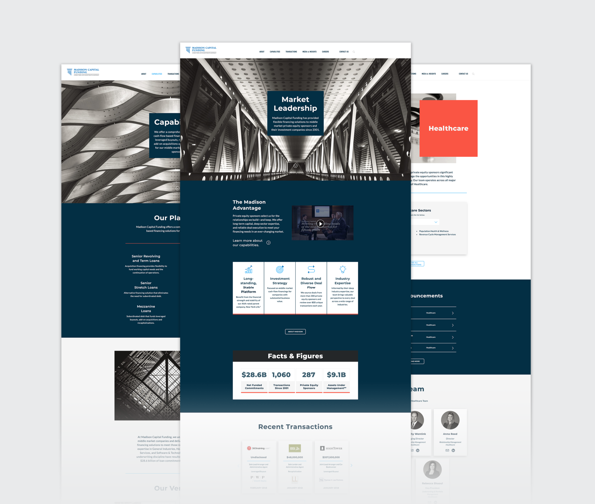
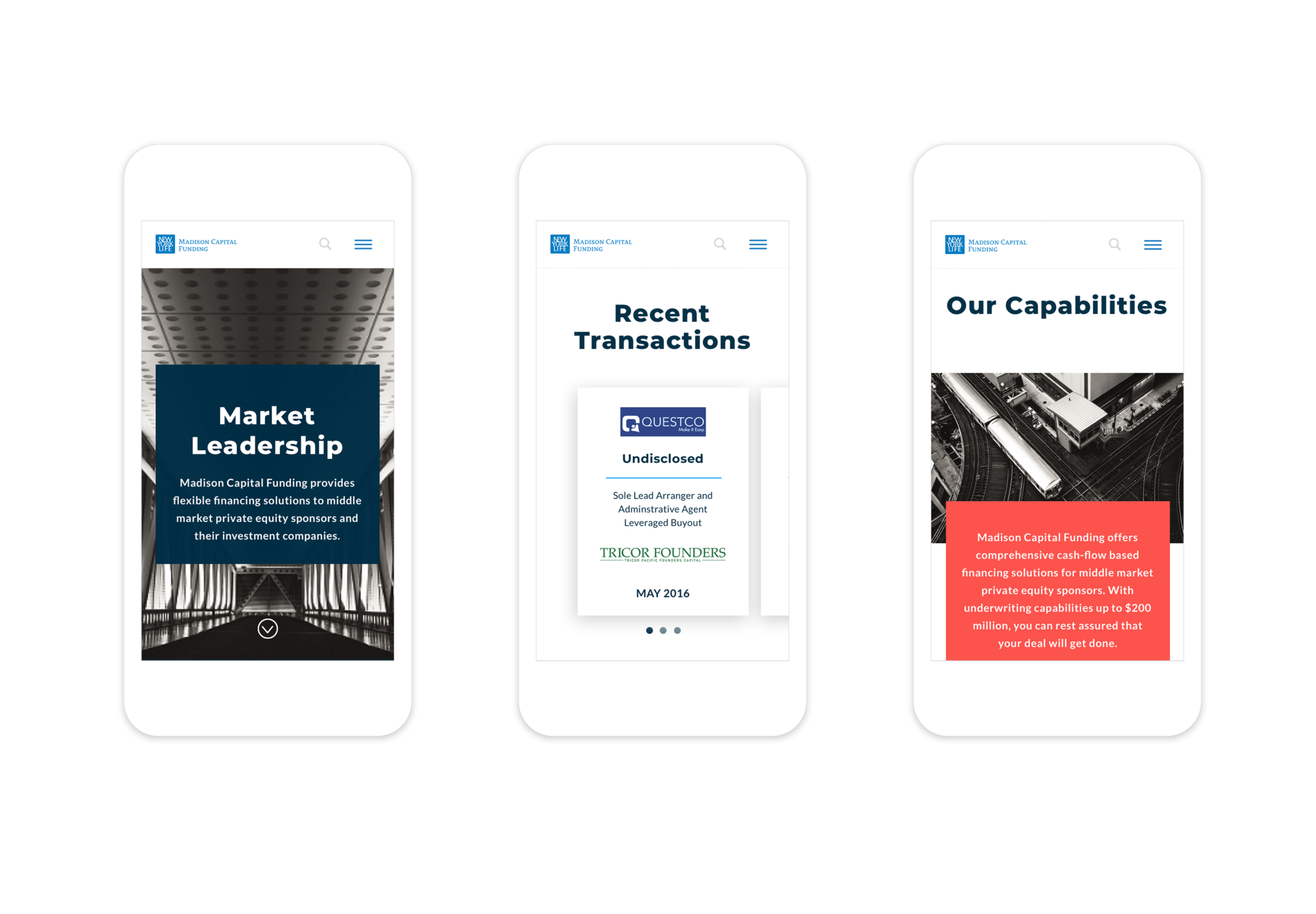
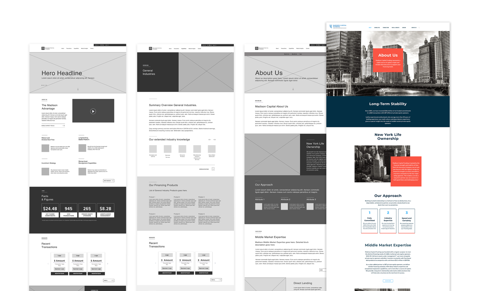
In order to build a unique identity for the firm, Suka designed a photo-driven visual style that featured tightly cropped architectural photography throughout the site. The unique, almost abstracted perspective and stylized black-and-white treatment of these images conveyed strength, stability, and sophistication. The photos also served to capture scenes from the city of Chicago, where MCF is based, that felt fresh and relevant without becoming clichéd.

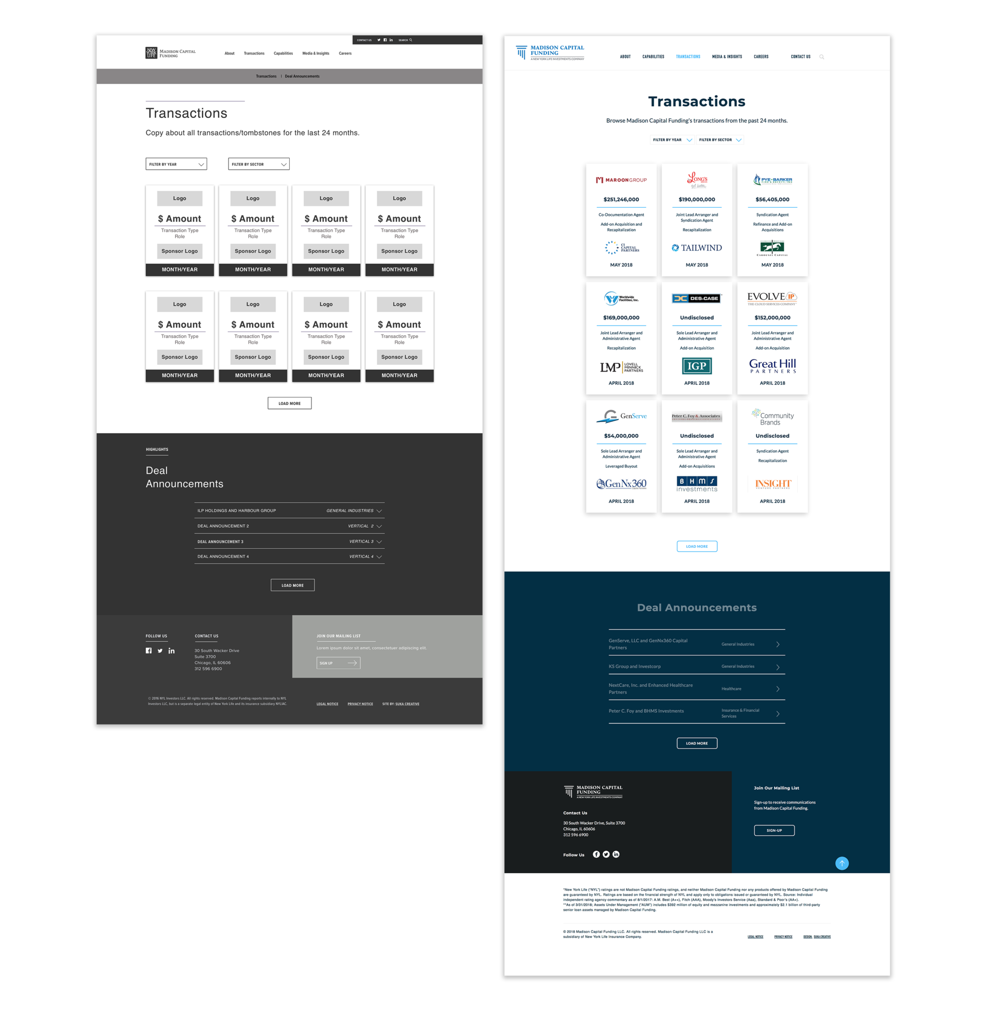
MCF also asked us to create a system to display recent deals and transactions as a way to showcase their ongoing activity in the market. We designed a simple card-based system with a quick overview of MCF’s recent transactions, listed chronologically, each of which led site visitors to a more detailed announcement. To facilitate usability, we added a tagging and filtering system to the cards so users could easily browse through and find the most current or pertinent information.
Colors

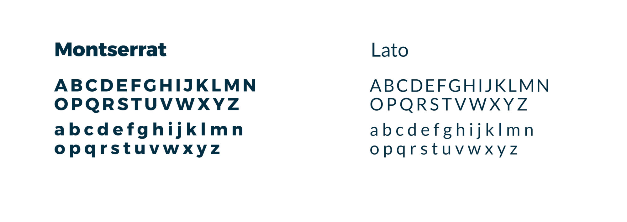
TYPOGRAPHY
The Result
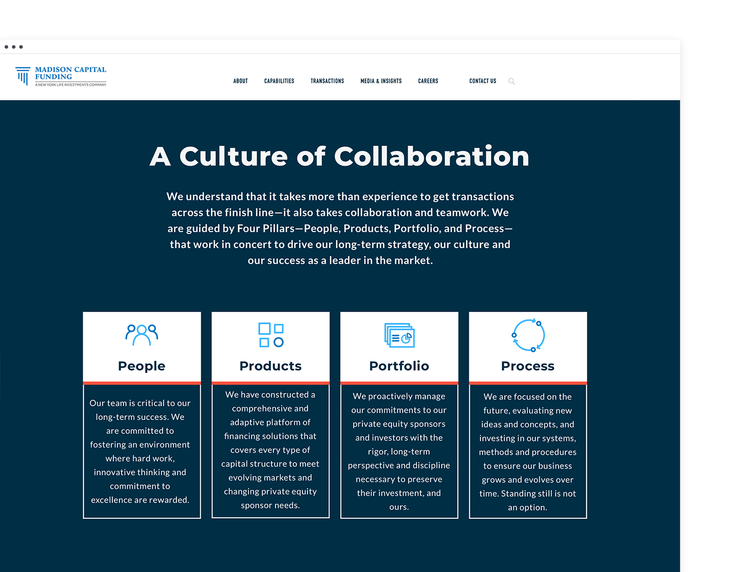
With brand, business, and user needs determined, Suka designed and built a powerful, modular CMS based on WordPress. With 25 different content modules to use, MCF could now build and manage unique, audience-focused web pages with full editing and management capabilities. The variety of modules meant that the new website could flex and scale over time as the company grew and as content needs changed.
Visit the website here.
